Project team: Ben Allen, Marco Nicastro / Balcony and window planting scheme: Todd Longstaffe-Gowan / Main Contractor: Sullivan and Company / Photography: French+Tye
Cabinet Of Experiments
We set out to use this project, the renovation of a two storey maisonette in Denys Lasdun’s Keeling House that the studio founder Ben Allen shares with his wife, as a vehicle to experiment, test ideas and prototype bespoke designs as well as to create a peaceful refuge high above the city.
A central departure point was the collection of artworks including a number of works gifted to Allen by the artist Olafur Eliasson while he was working Eliasson’s Berlin studio. Many of these are optical pieces which use glass and mirrors to create visual illusions and compositions, one of these consists of two mirrors mounted in a corner that gives the appearance of the mirror merging into the wall. We developed a number of architectural interventions throughout the property that play with semi-circular and circular mirror and brass surfaces that appear to dematerialise the solidity of the concrete walls using an optical effect.
The studio cites the Soane Museum as a strong influence on this project and the work of the studio as a whole, including, in this case Soane’s use of mirrors to create a greater sense of space in that building. Allen was keen to display a number of his studio’s working prototypes as well as the couple’s collection of unusual found objects to give rise to the spaces being reimagined as a cabinet of curiosities of sorts.
The project has been featured in The Financial Times, Design Anthology UK, Dezeen, The Weekender, Clever, and The Telegraph.
Despite the brutalist exterior and the high rise setting, the compact two storey layout of the flat means that it feels more akin to a modern cottage in scale. The lower entrance floor of the maisonettes, in Lasdun’s original 1950’s interiors had galley style kitchens (with space for a small table) separated from the living rooms. The building was renovated in the late 1990’s following the threat of demolition and subsequent granting of listed building status. The interiors were modernised and remodelled as white, minimal spaces, with the separated kitchens and living rooms converted into one open plan kitchen, dining and living area.
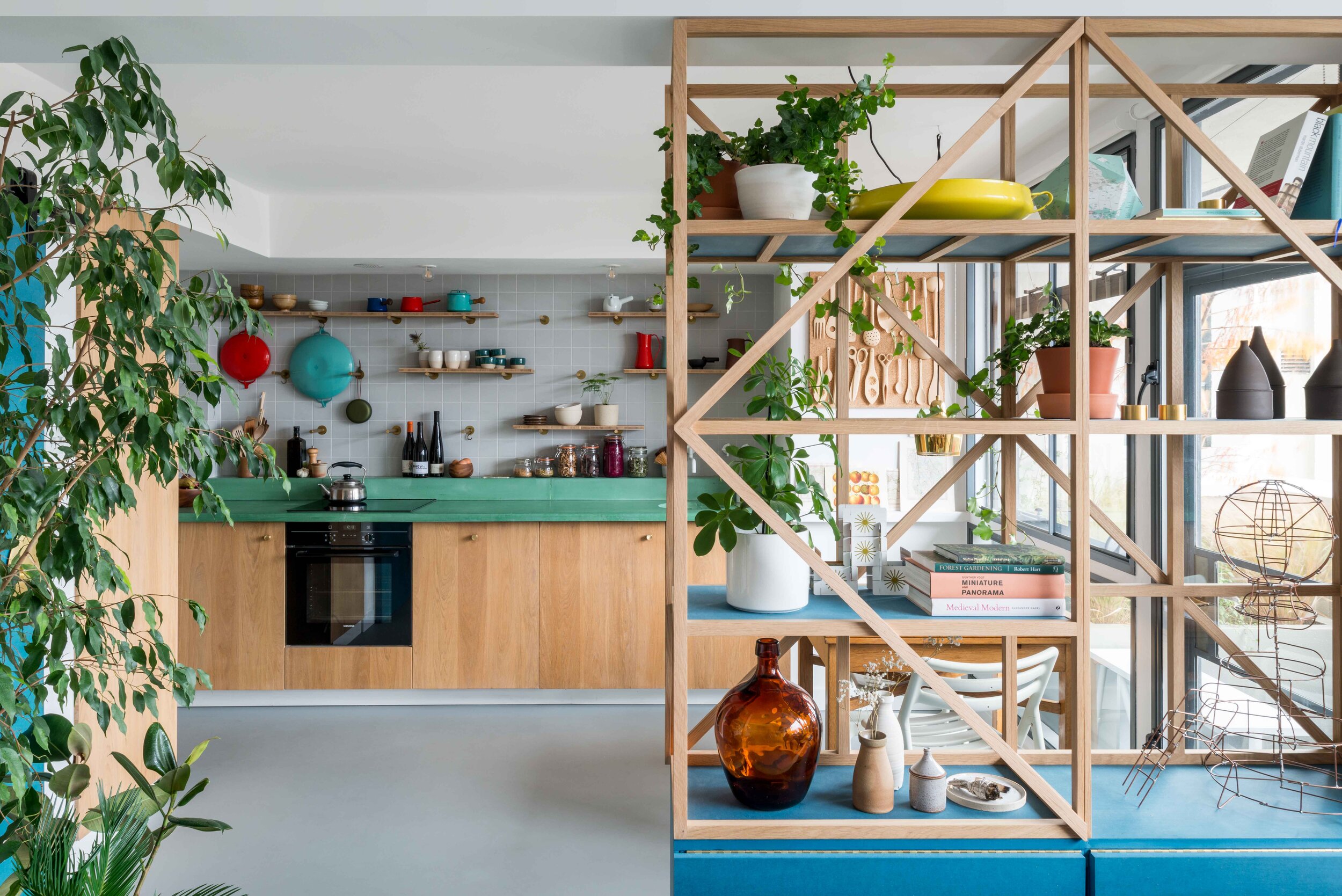
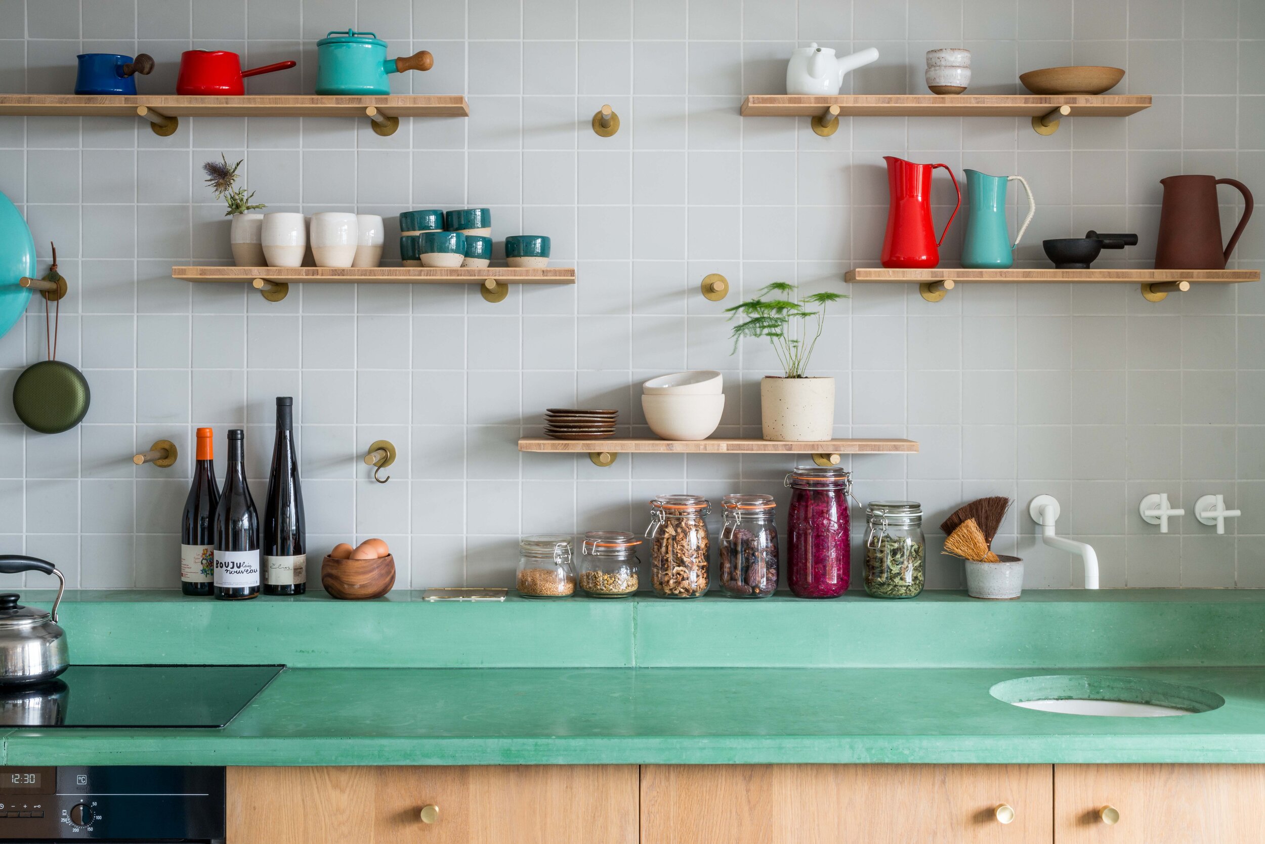
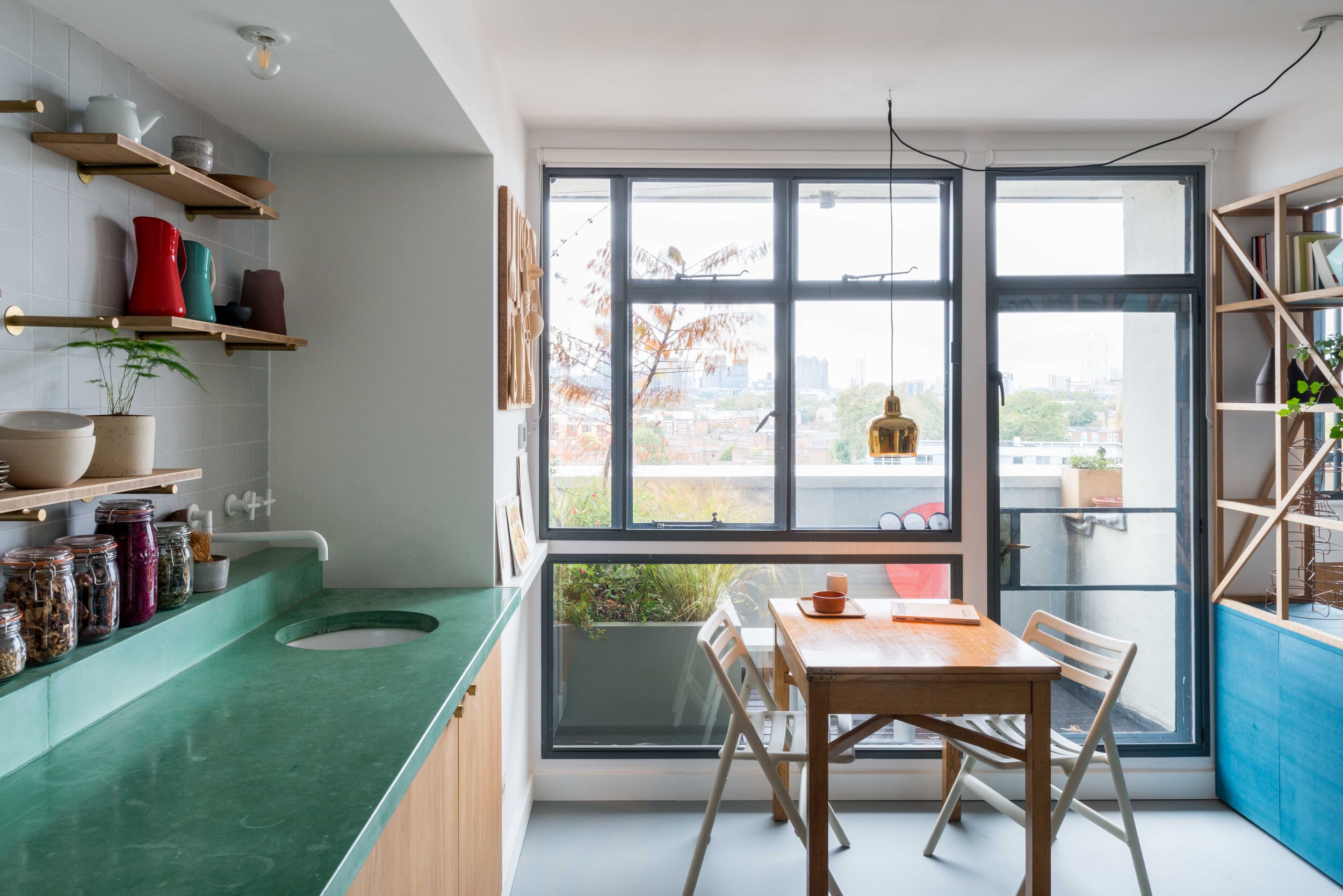
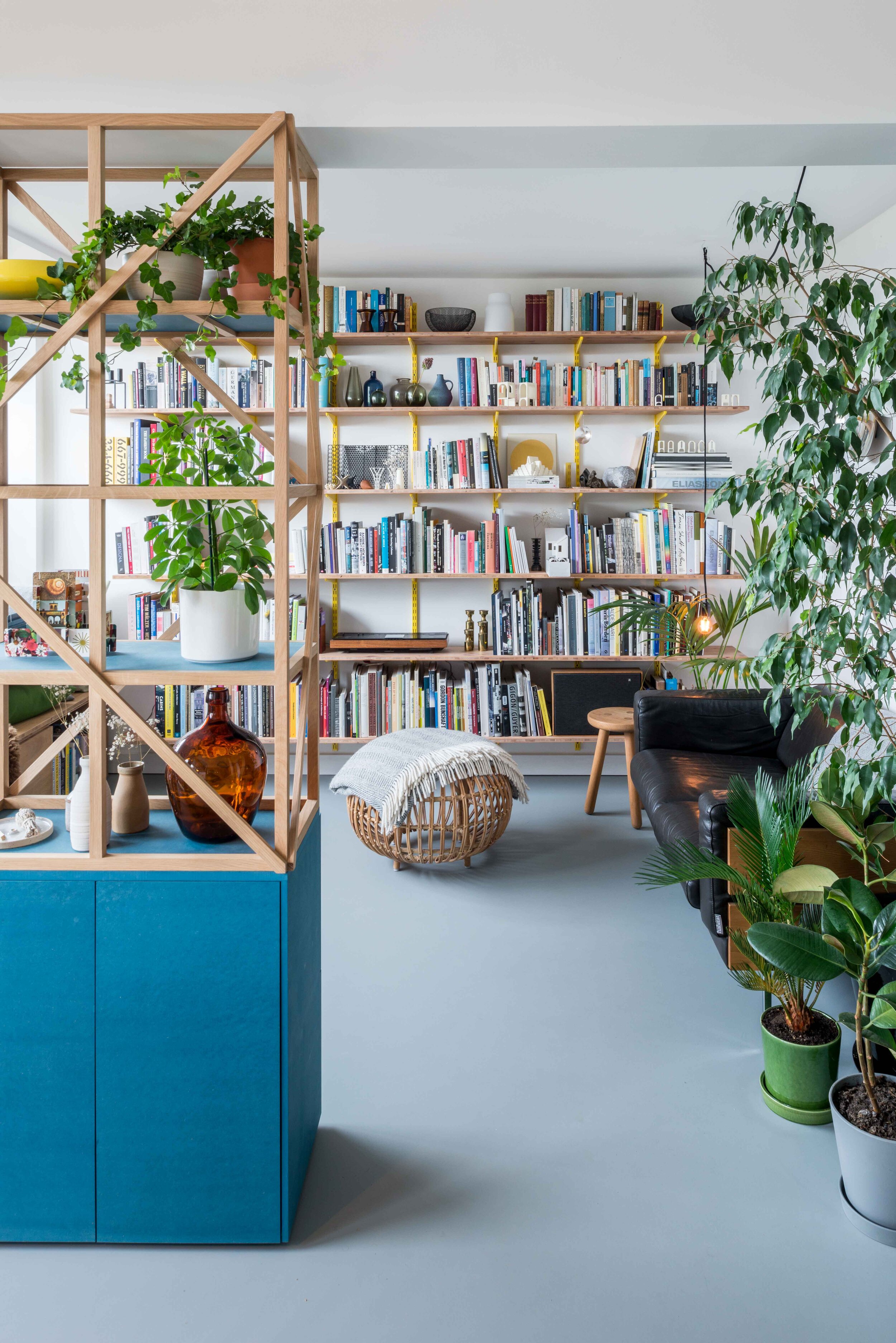
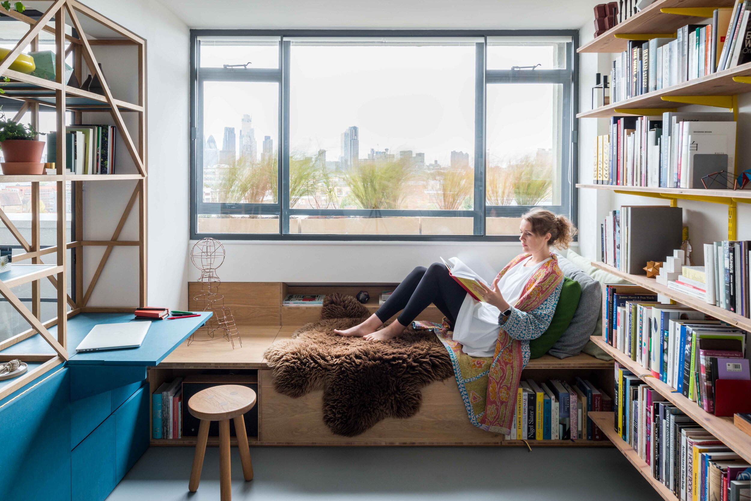
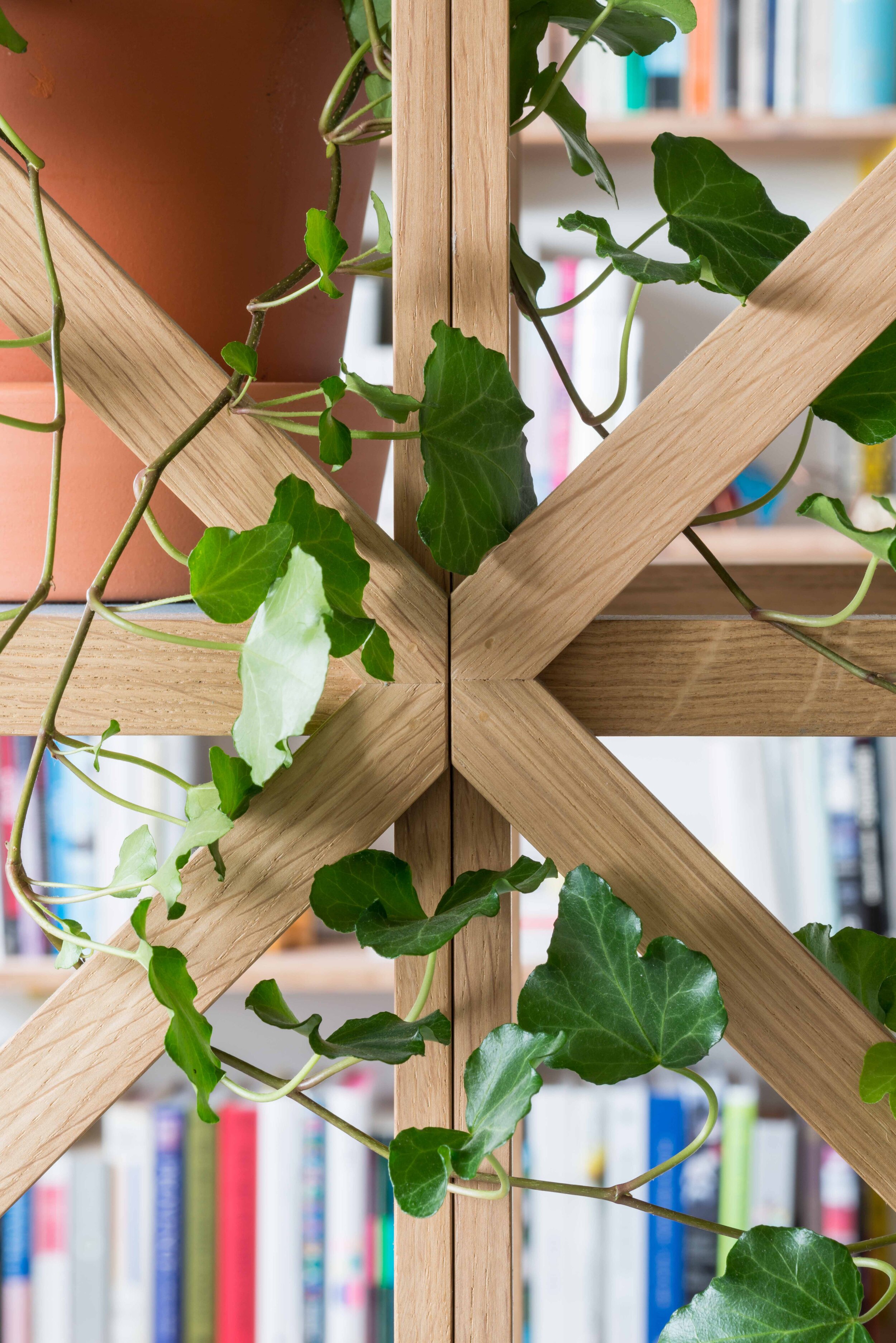
We were keen to show how the interior could be reimagined as a warmer and more intimate space. By reconfiguring the kitchen, we could reinstate the original layout with the counter running the full length of one wall, gaining more floor area and connecting back to the original layout. A full height trellis shelving unit, based on those that the studio has designed in a number of its workplace projects partially divides the room, breaking down the scale whilst still maintaining visibility between the two spaces and acting as a memory of the wall that originally divided the rooms. In this case the unit is intricately designed to house double sided cupboards with space for crockery on dining area side and a fold out desk with home office storage on the living area side. An oak window seat lines one side of the living / sitting area and doubles as a large storage unit and shelves.
Materials throughout are robust, utilitarian and chosen to improve with age. Solid oak, blue through colour wood fibreboard, green concrete, quarry tiles, brass fittings and a poured rubber floor (with underfloor heating) have also been chosen to give a sense of tactile warmth both when the flat is flooded with daylight (its south west aspect and large expanse of glazing gives generous natural light) as well as on overcast days and at night.
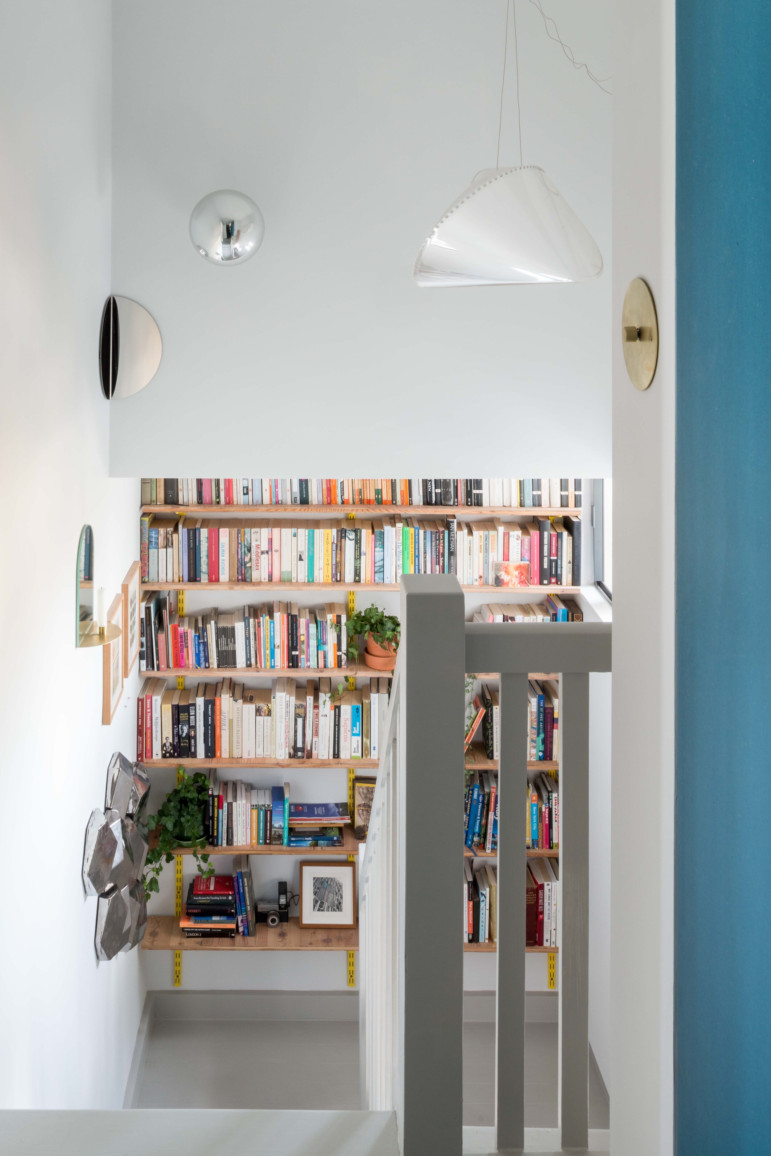
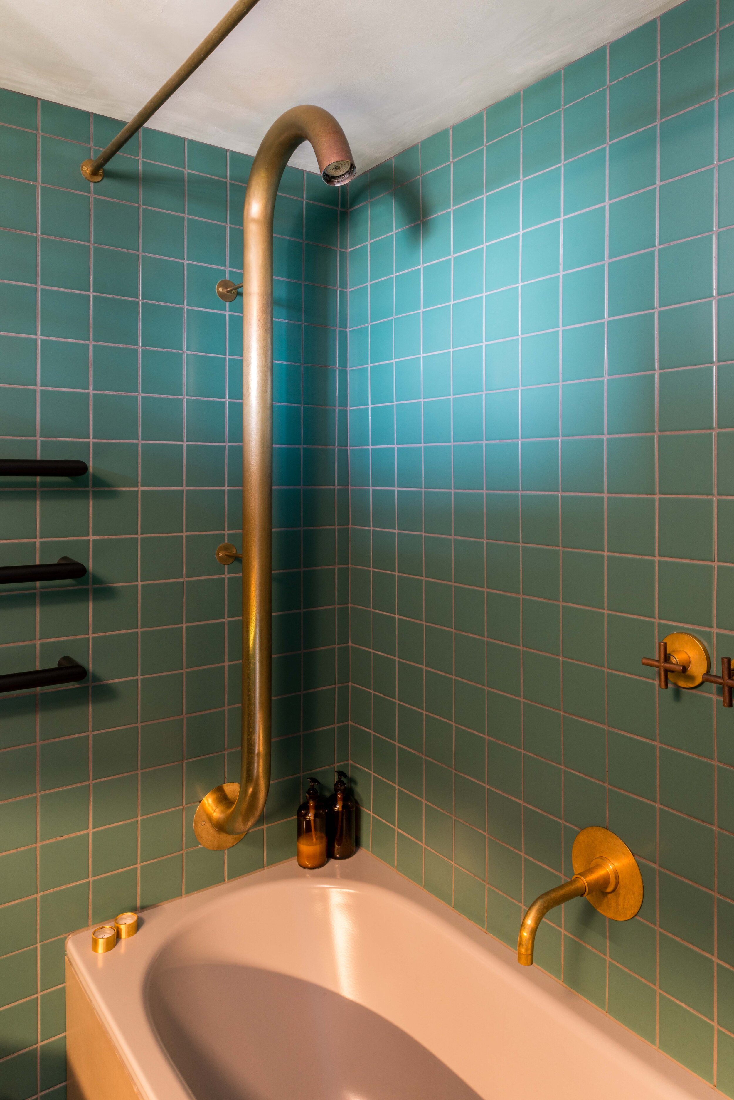
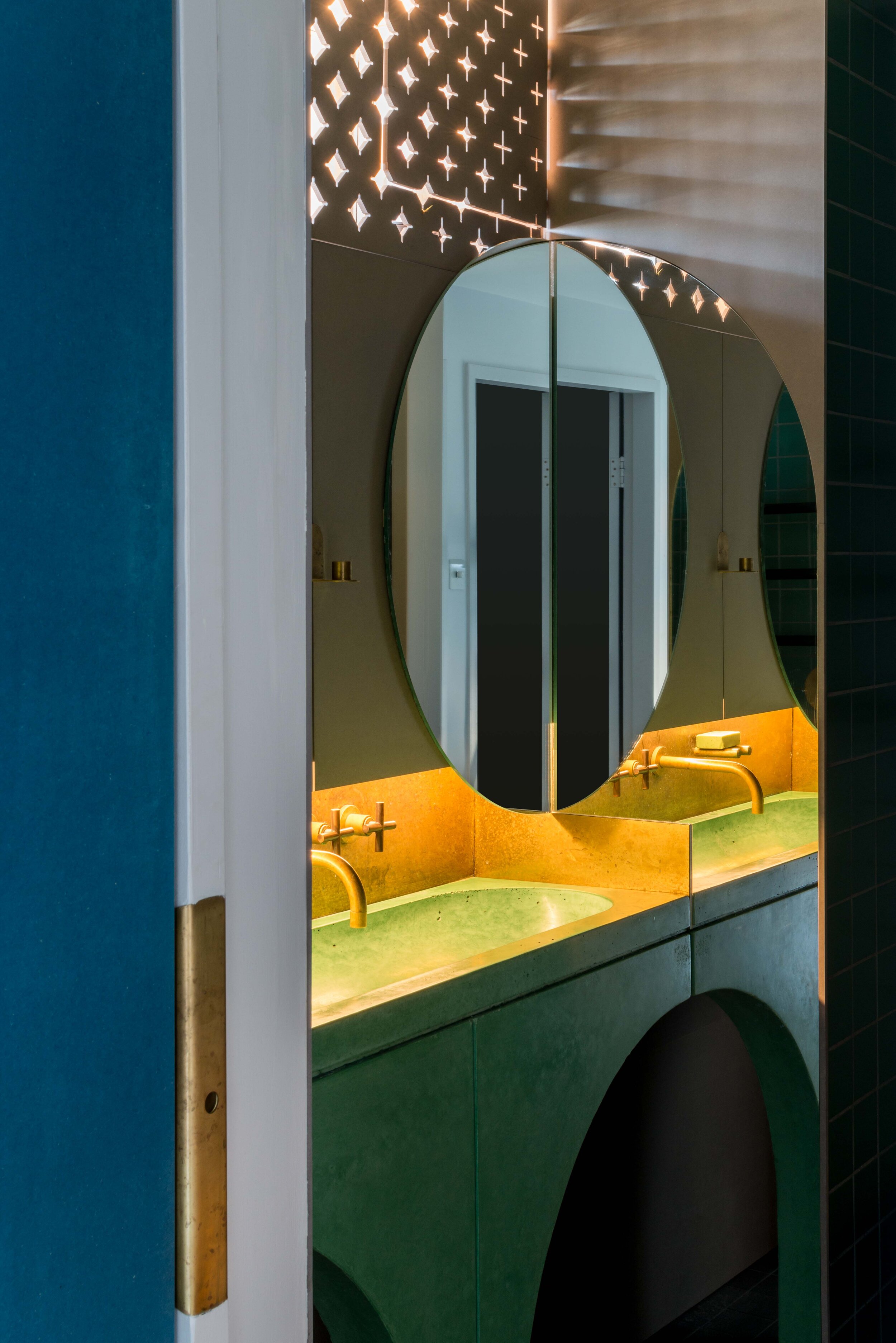
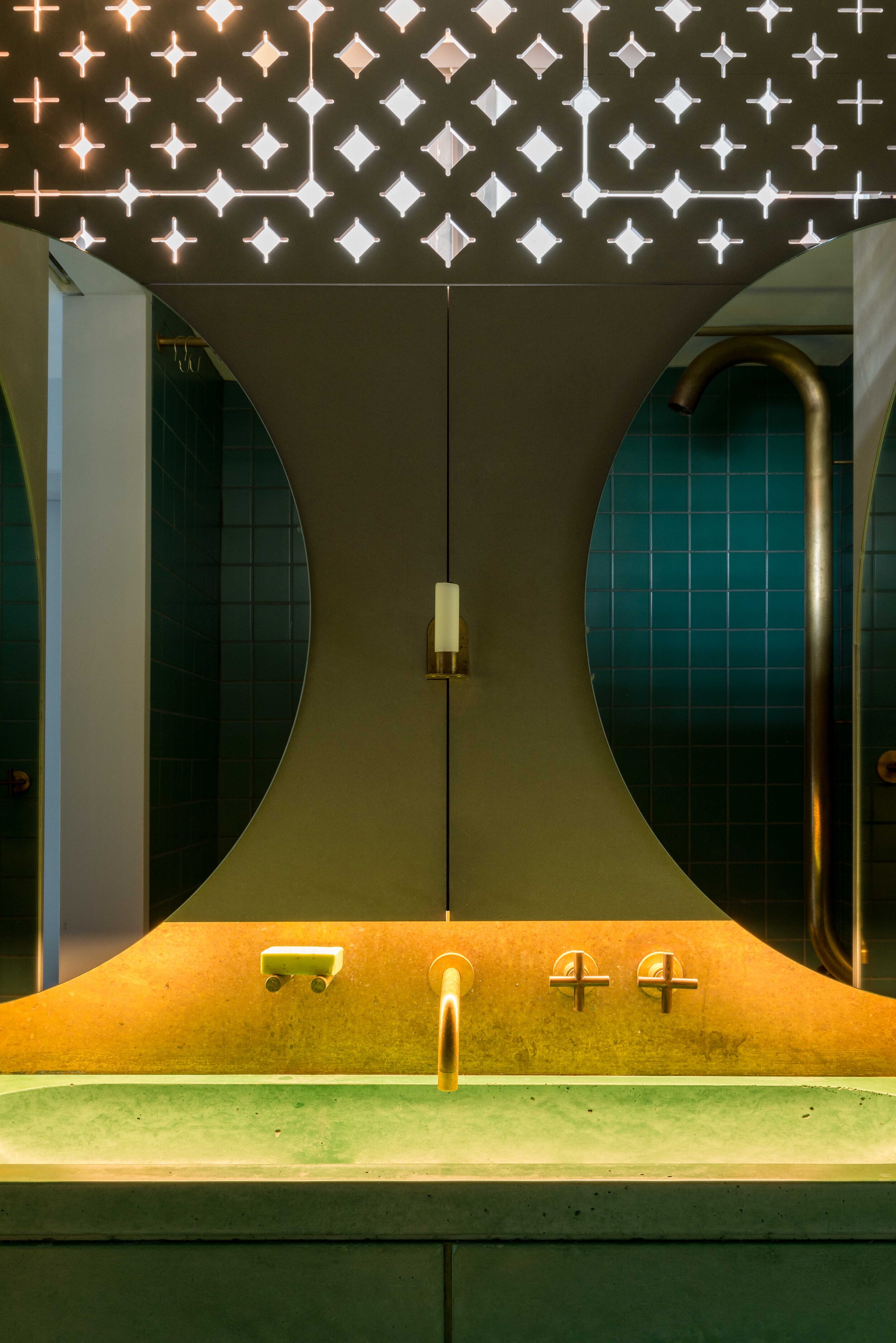
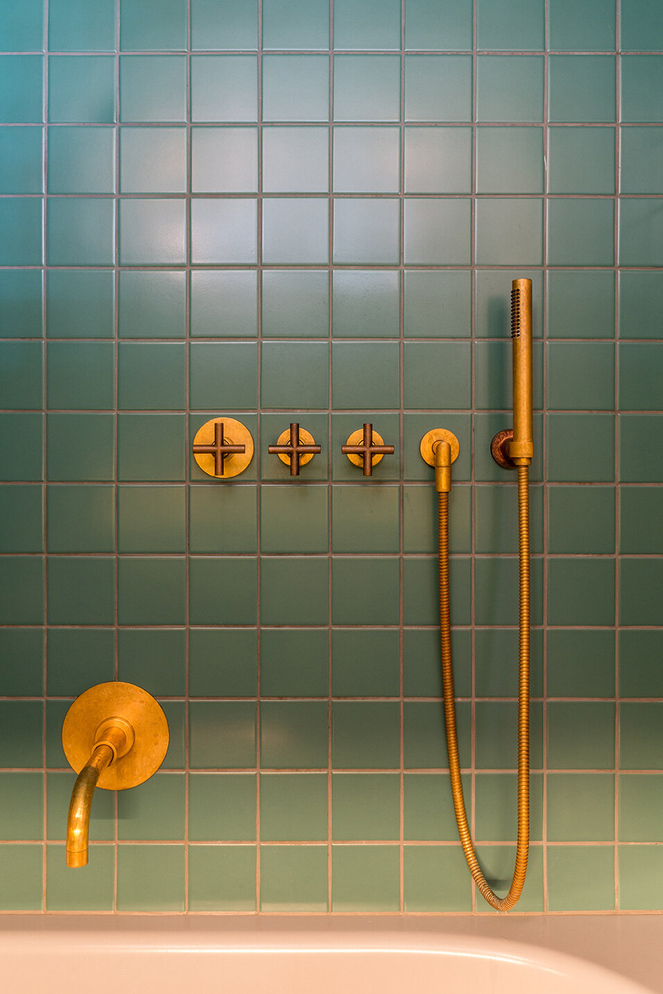
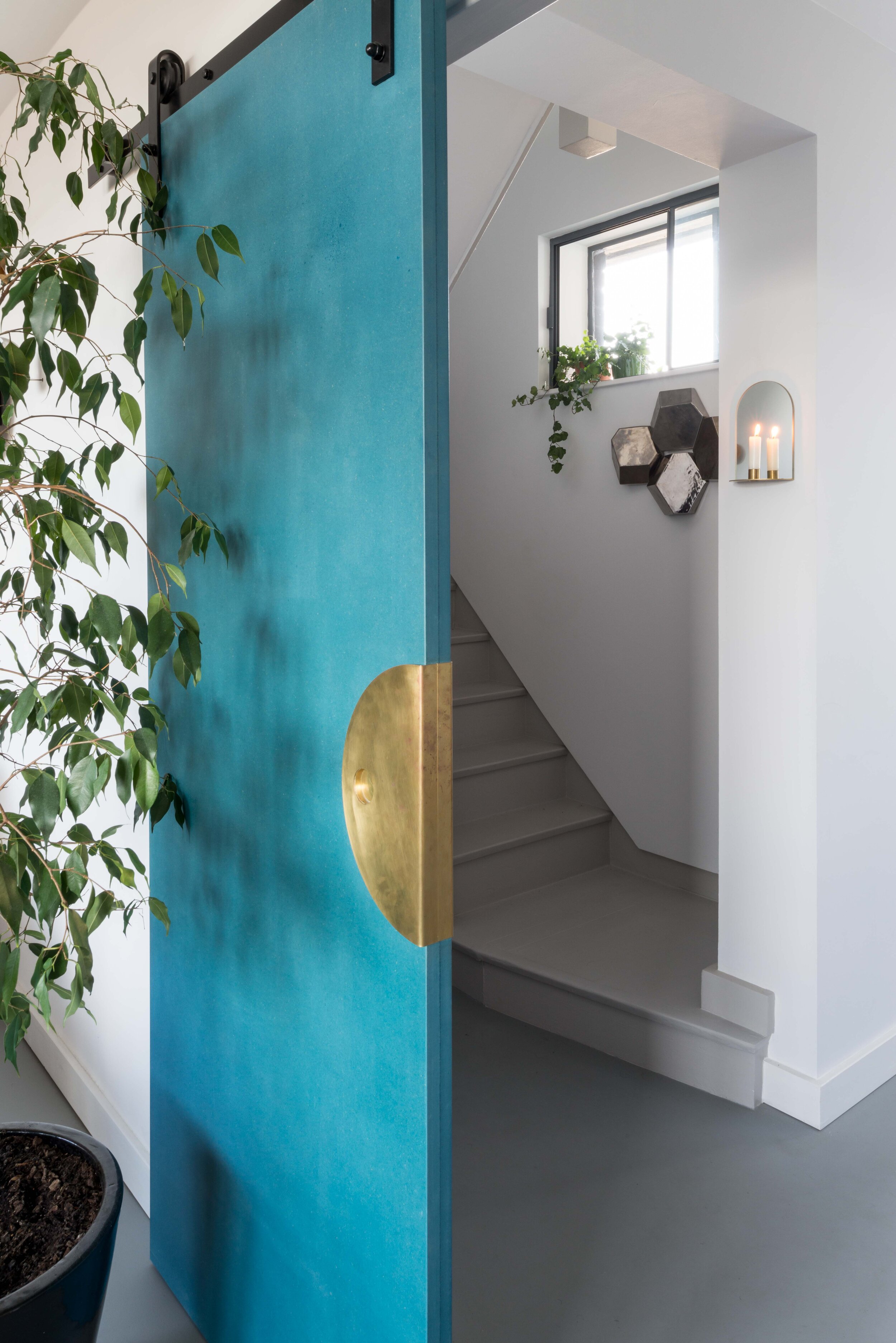
On the stairs bespoke mirror and brass candle holders adorn the walls along with more artworks as well as a collection of samples and prototypes from past projects. At the top of the stairs the reflected geometry leitmotif continues in the bathroom with two pairs of semi-circular mirrors (two of which act as cupboard doors) and give the impression of two floating spheres dematerialising into the walls. The pedestal of the bespoke green concrete wash basin is formed of two half arches –mirrors on either side create an infinity of arches visible as one climbs the stairs. Taps and spouts have been customised and stripped back to their natural brass and allowed to tarnish as has the brass backsplash and flush plate. The bespoke shower, fabricated from a large diameter bent brass tube, reinforces the sense of robustness and solidity. Two hinged fretwork internal shutters filter the natural light. We wanted the bathroom to be purposefully darker to contrast with the brightness of the rest of the flat and to imbue it with a sense of refuge.
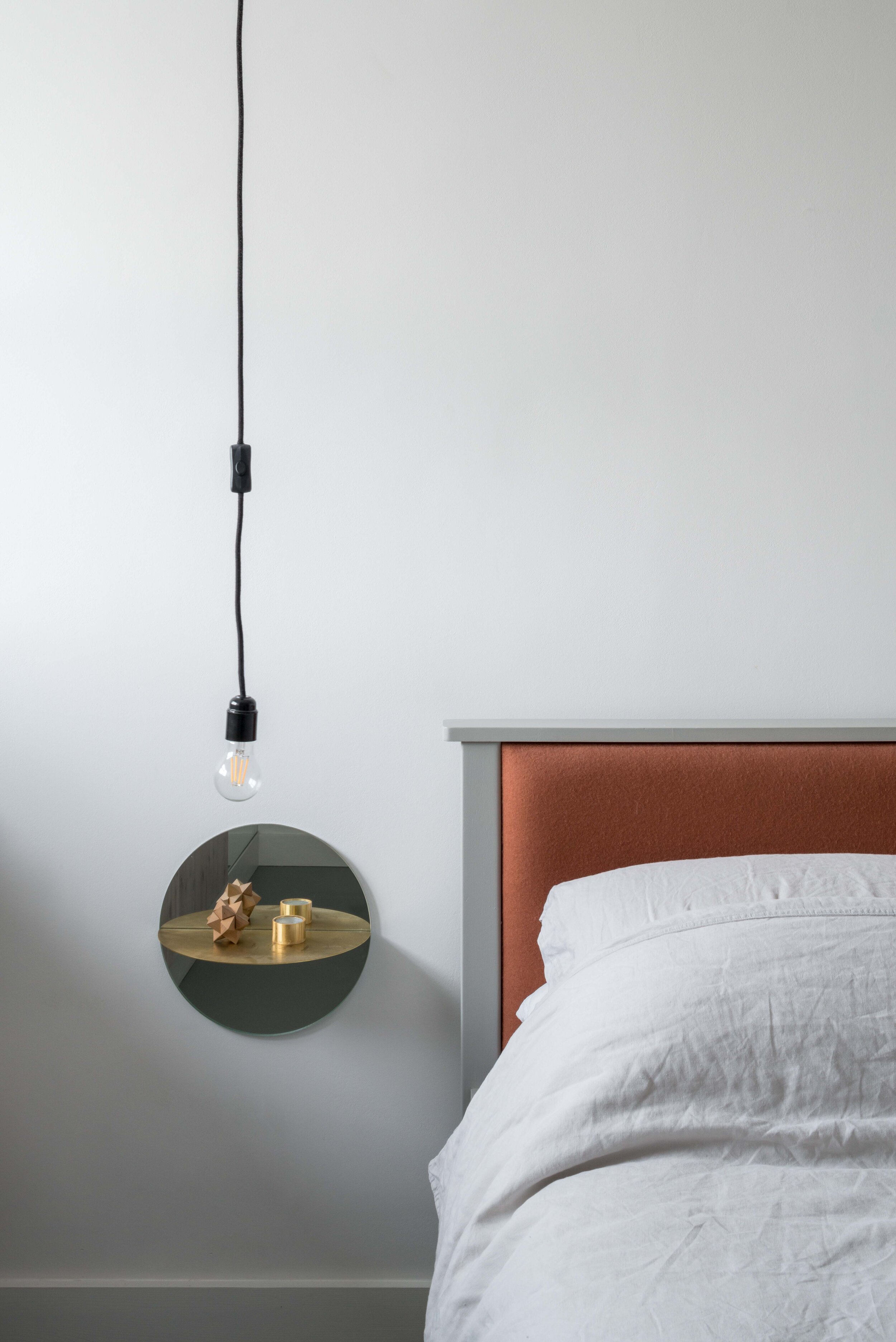
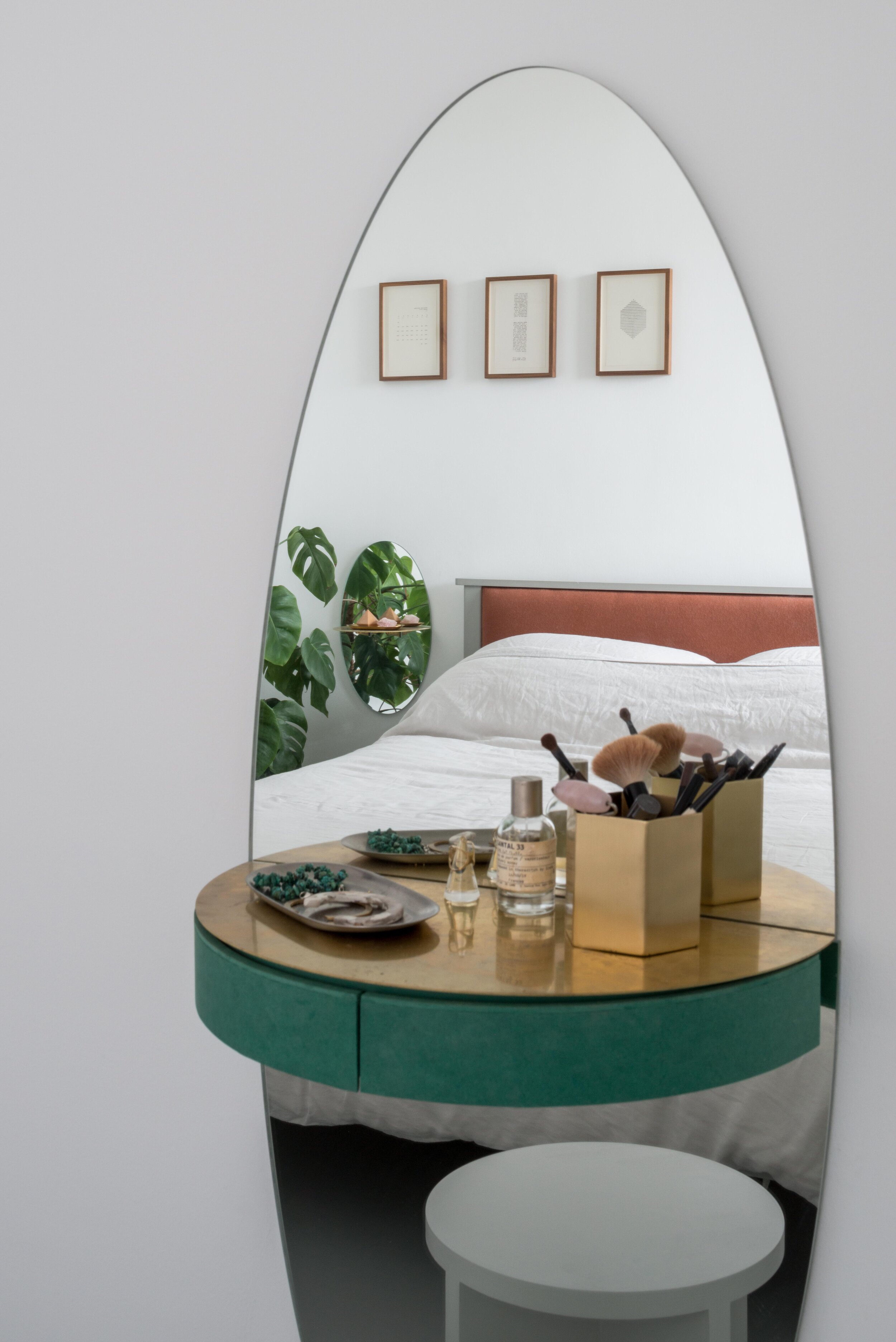
Two circular and elliptical mirror pieces (similar to those on the stairs) act as bedside tables. A wall mounted vanity unit with an elliptical mirror, brass surface and green dense fibre board drawers, complete this playful trio, each visible in the others reflection. Larch cupboards line both study and bedroom exterior walls. In the study these are integrated with a standing desk in front of the window whilst in the bedroom they are integrated with a second window seat and storage unit giving the feeling that the window has been punched into this timber lining. Sliding doors to the living room and bathroom both have bespoke brass push plates mirroring the semi-circular and elliptical forms elsewhere.
Planters on the balcony and window boxes on the three metre long living room window ledge are densely planted with wild grasses interspersed with flowering annuals. On the balcony the planter that extends over a third of its area, is also planted with a sculptural Rhus Typhina tree. Enough space is left for a small bench, just big enough for two, to sit and enjoy the views over the city and the sunset over Hampstead Heath.
Technical description
The catalyst for this project was the decision to insulate the walls internally and install new electric underfloor heating (there being no gas in the building) in order to improve the thermal performance and efficiency in terms of energy use. The project was used by the studio to explore a variety of smart home technologies including smart heating controls, ventilation control and air quality testing including VOC analysis.
Lighting was an important consideration –as the studio was keen to test a fully LED lit lighting solution for comfort, energy saving as well as health and wellbeing reasons. The lighting is all LED and in the majority of locations the lighting is exposed classic pear shaped bulbs with the warmest colour temperature commonly available (2700K). It is electronically dimmed, which allows the lighting to be dimmed down to almost zero – lower than candle lighting. This is increasingly being seen as important in for health and wellbeing in order to reduce the impact of blue spectrum light on our circadian rhythms at the end of the day and prior to sleeping. This was also driven by the requirement to be able to dim the internal lighting to afford the best views of over the city at night.
