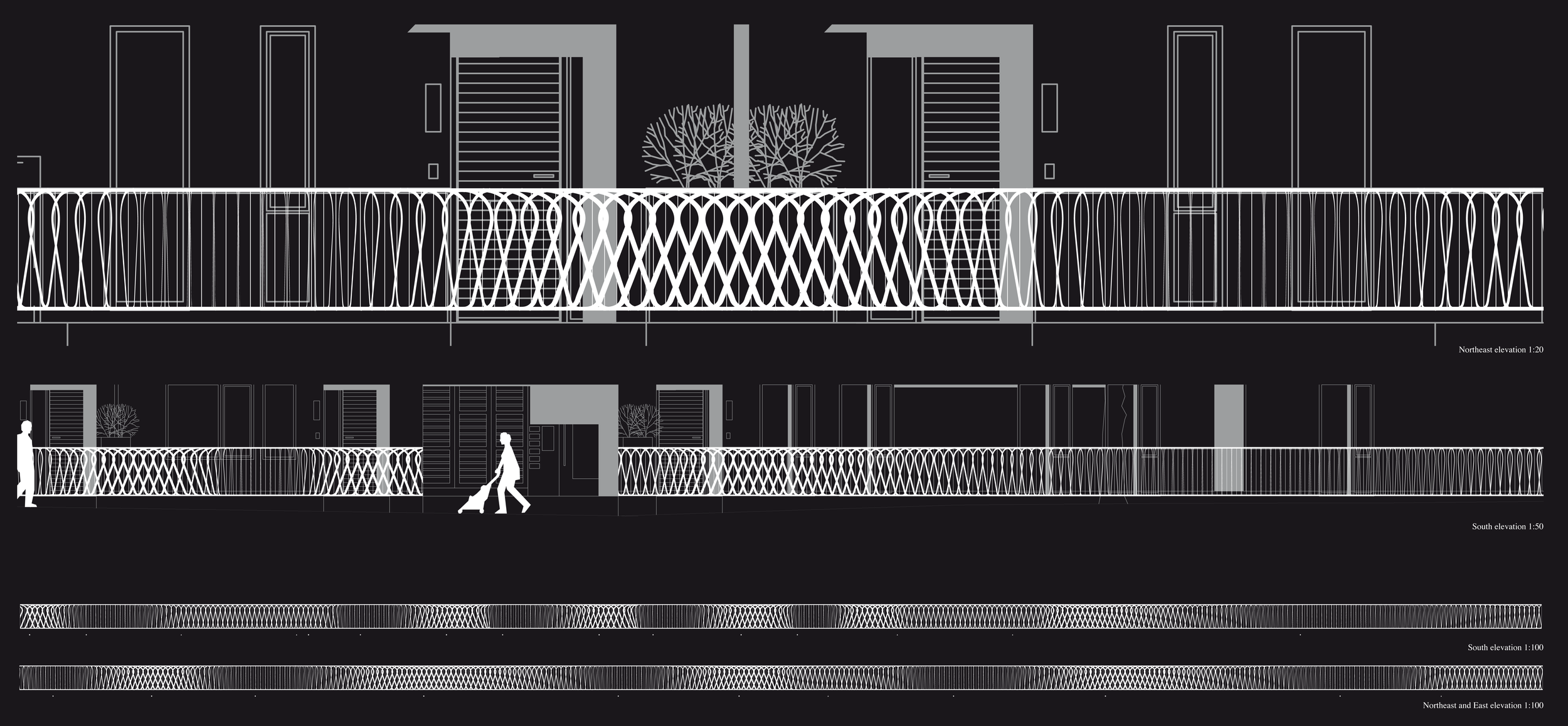
1st place in competition organised by Hackney Council / designed in collaboration with Ricardo Gomes of KWY
New Victorian
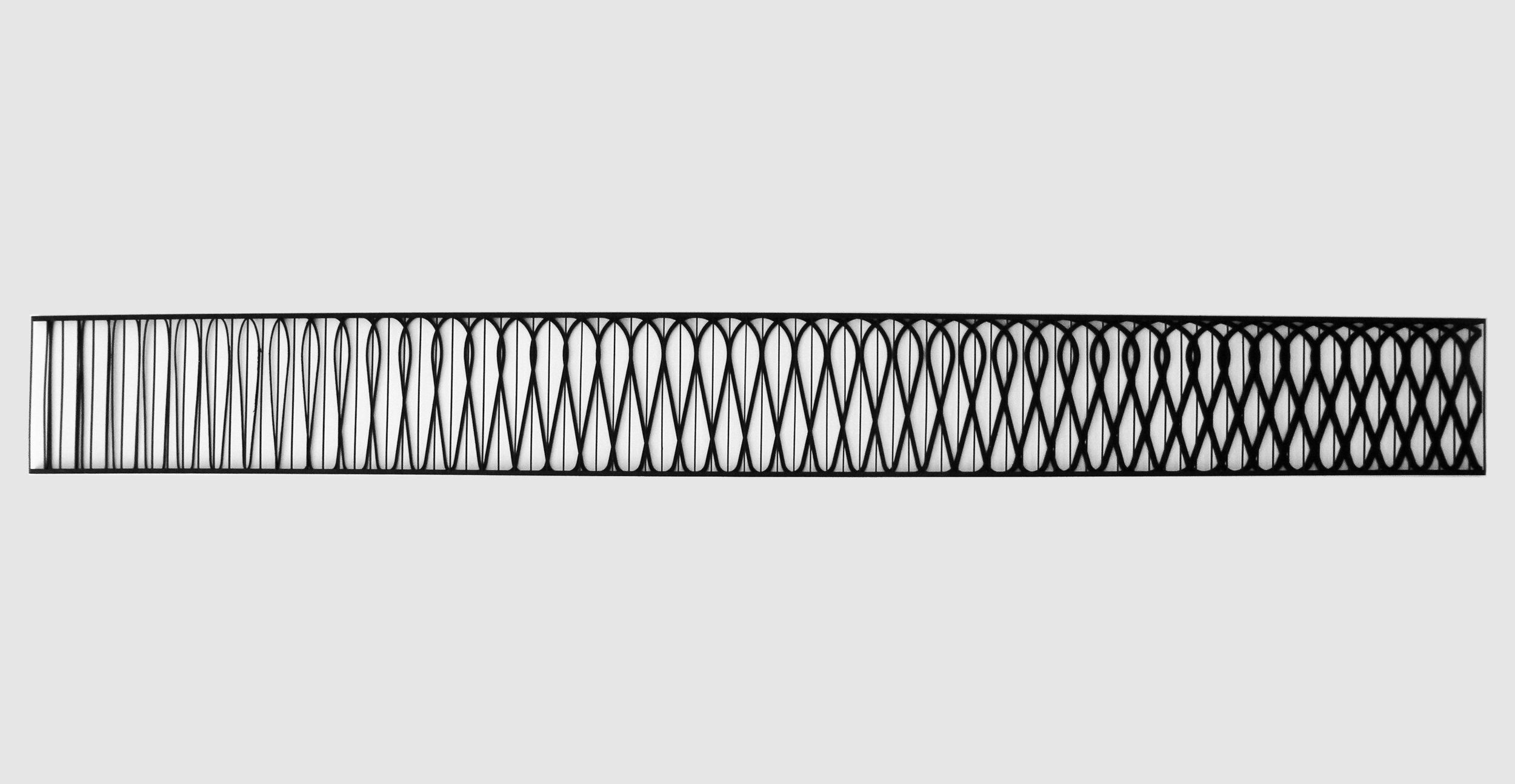
Another project from the archive, New Victorian was a parametric design for a set of railings for a new housing development commissioned by Hackney Council in London and designed in collaboration with Ricardo Gomes of KWY. Inspired by London’s ornate Victorian railings as well the neighbourhood’s prominence as a centre of the silk weaving industry in the 17th and 18th centuries and is inspired by the neighbourhood’s new status as a vibrant technology hub - the work is a mediation between these two identities.
New Victorian is a work of art and architecture that is intended as a connector between the proposed building, the urban landscape and the public and private realms. The proposal draws upon Hackney’s craft heritage, its prominence as a centre of the silk weaving industry in the 17th and 18th centuries and is inspired by the neighbourhood’s new status as a vibrant technology hub - the work is a mediation between these two identities.
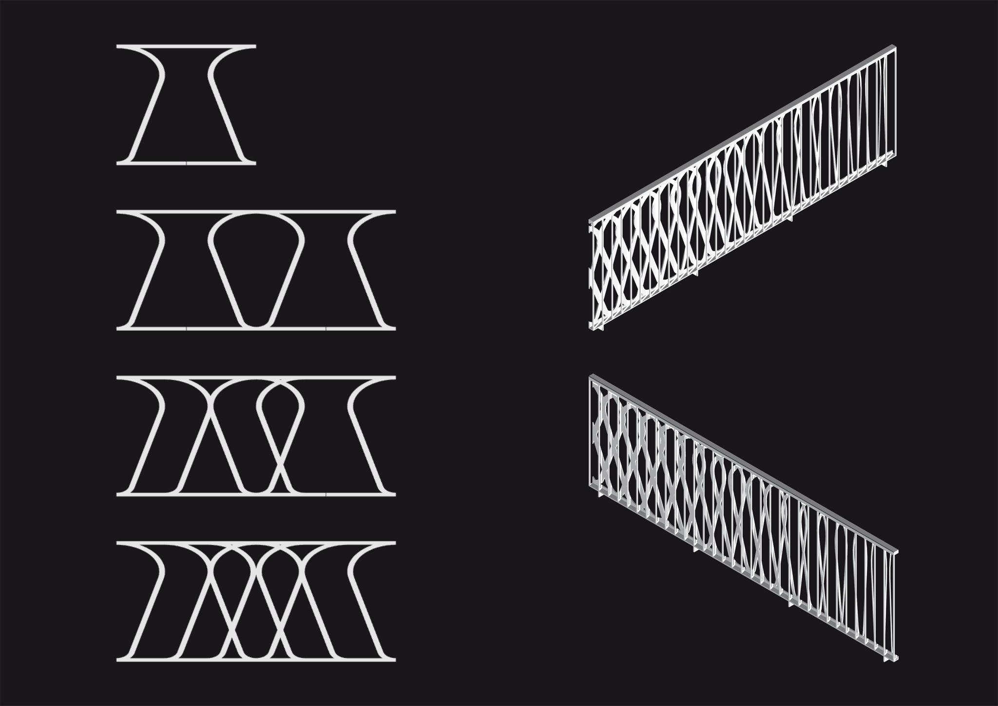
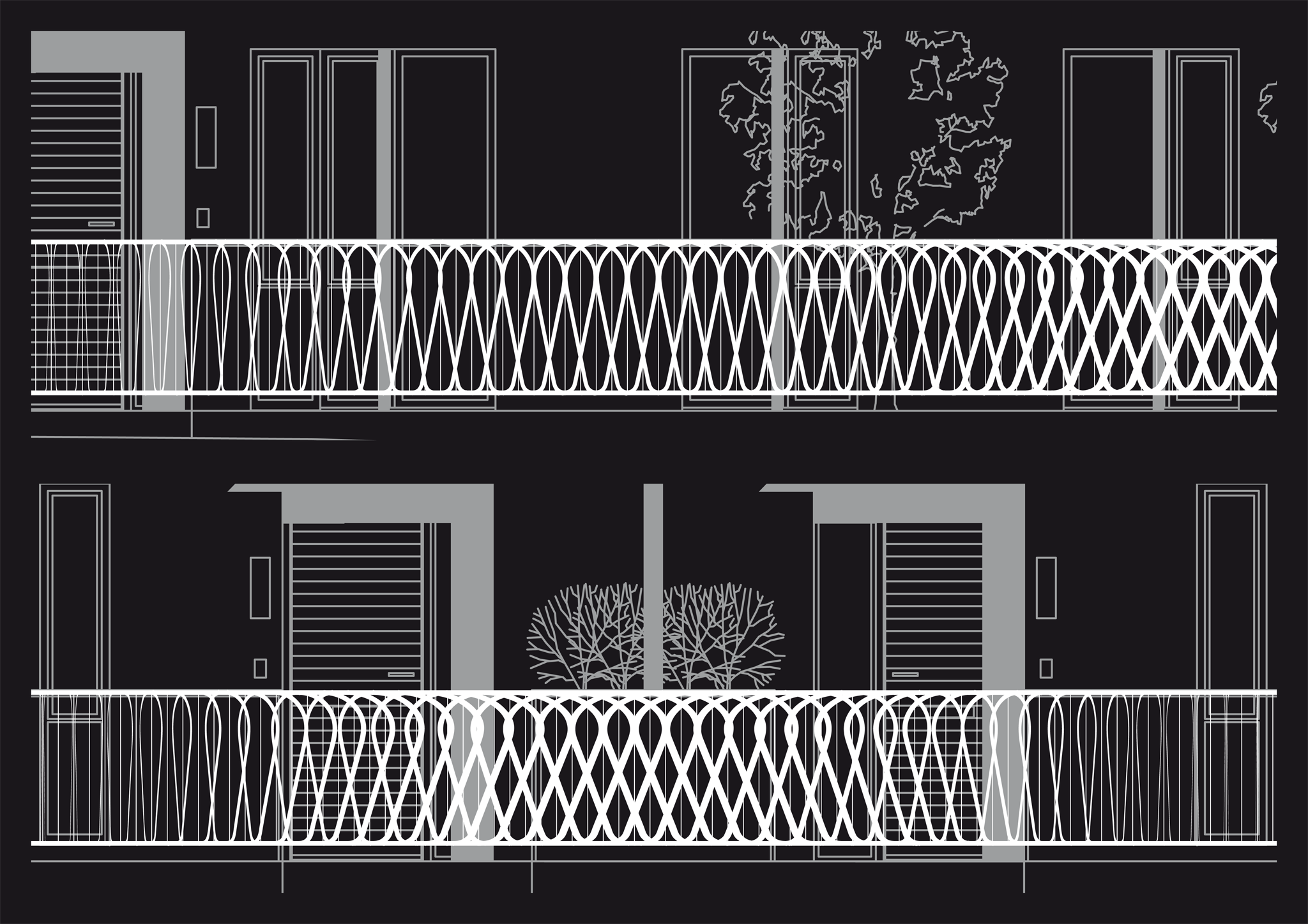
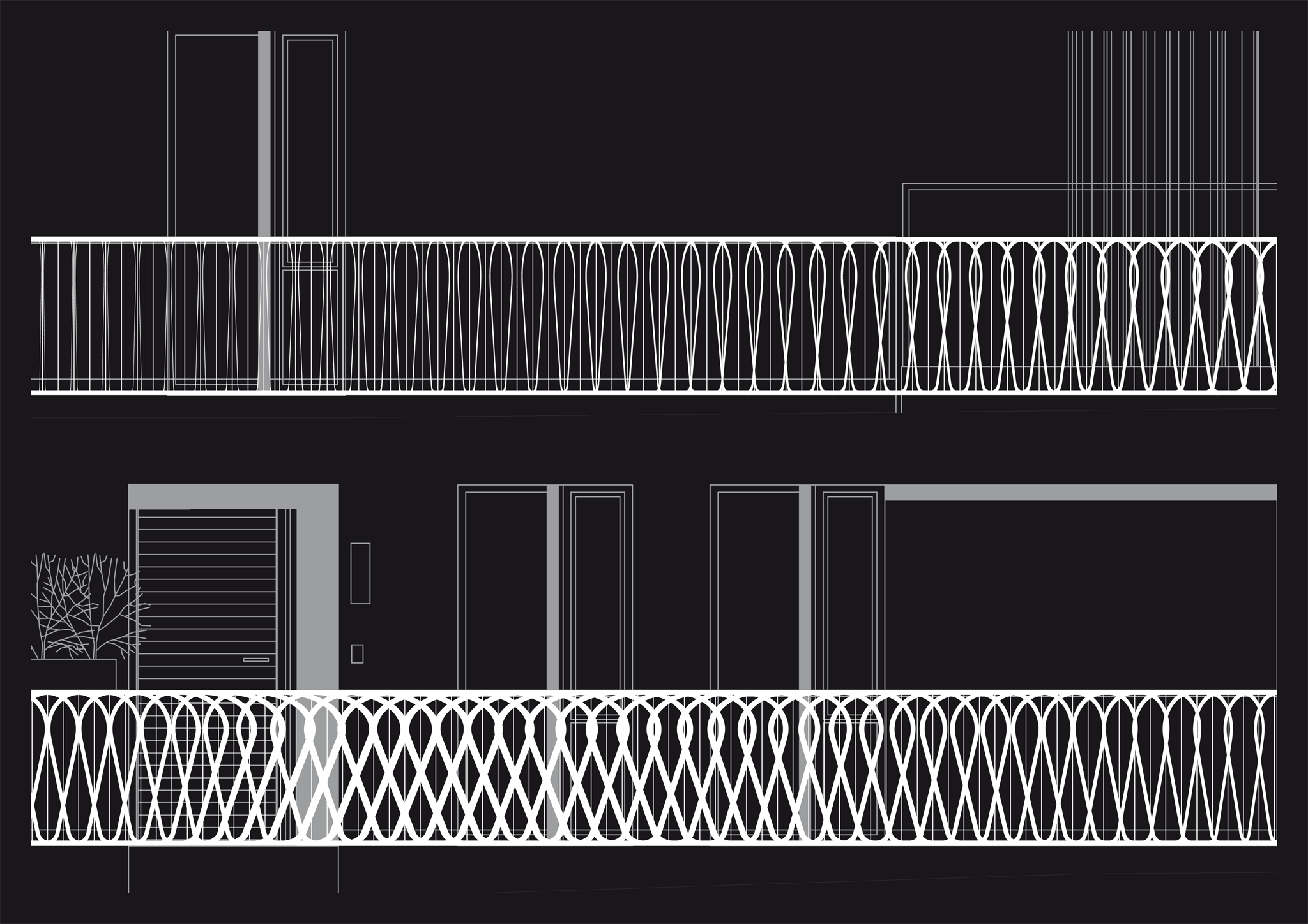
The design development began by tracing elements of gates and railings from Glasgow’s historic Sun Foundry design catalogue which contains some of the most commonly found ironwork across Victorian London, including those designed by eminent 19th Century architects such as Alexander ‘Greek’ Thompson. From this starting point recurring motifs (such as the ‘S’ curve) were interpolated using a parametric design process, enabling the pattern of the railings to be stretched, tuned and modified to the varying rhythms and functions of the facades, gardens, light wells, bin stores and main flat entrances. The degree of transparency is also varied to suit these situations – thus the pattern is more closely woven in the areas in front of the bin stores and private entrances and it is more transparent in front of the light wells, unfurling to become a traditional baluster.
The railing is fabricated in two layers of painted steel connected with a wide top rail. These layers comprise of standard solid square steel profiles and laser cut steel plates – on the building side of the railing. At its narrowest the pattern scales down to the standard square steel profile which could also be used in other areas of the project for consistency. This double layering gives a subtle moiré effect to the pattern, animating it as one passes by. The solid top rail is designed as a handrail with radiused corners to offer a guide for elderly or infirm citizens. The railings running perpendicular to the building are made of the simple straight elements, with the exception of where the main railing returns towards the building at the large gates and the two main flat entrances, in which case the pattern is continued, visually connecting the street with the building.
The pattern weaves in and around the building’s forecourt, physically connecting landscaped and functional elements of the architecture and public and private domains. Envisioned as mediating structure rather than a barrier, we see it as a social connector.
